Help Musicans
— 2026
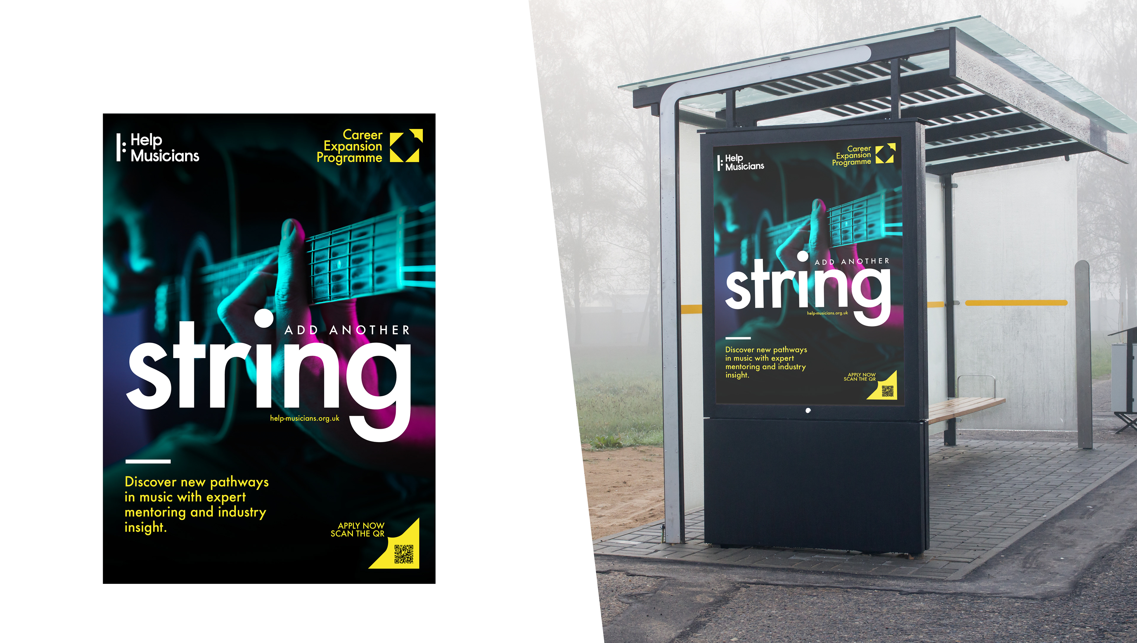
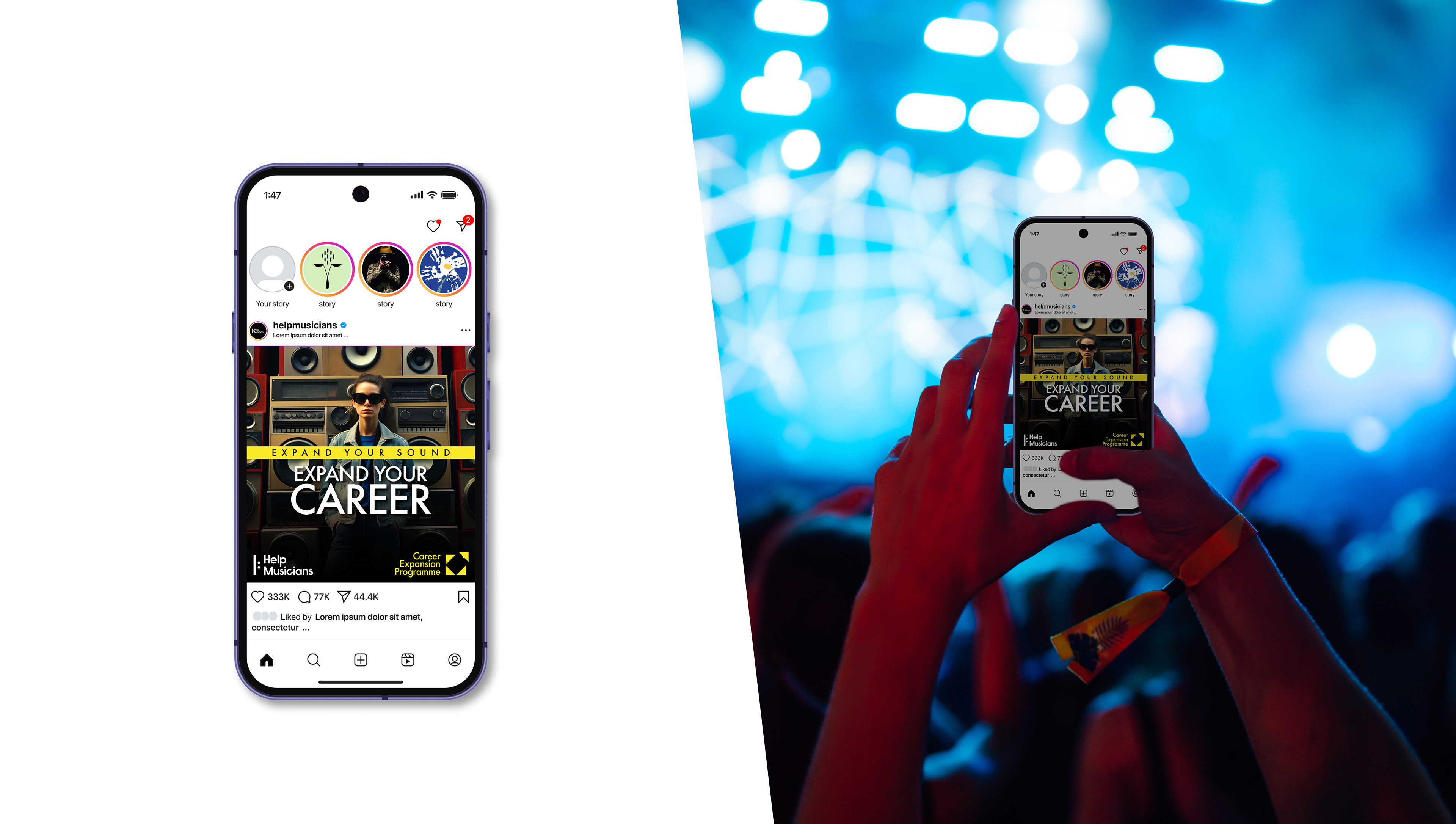
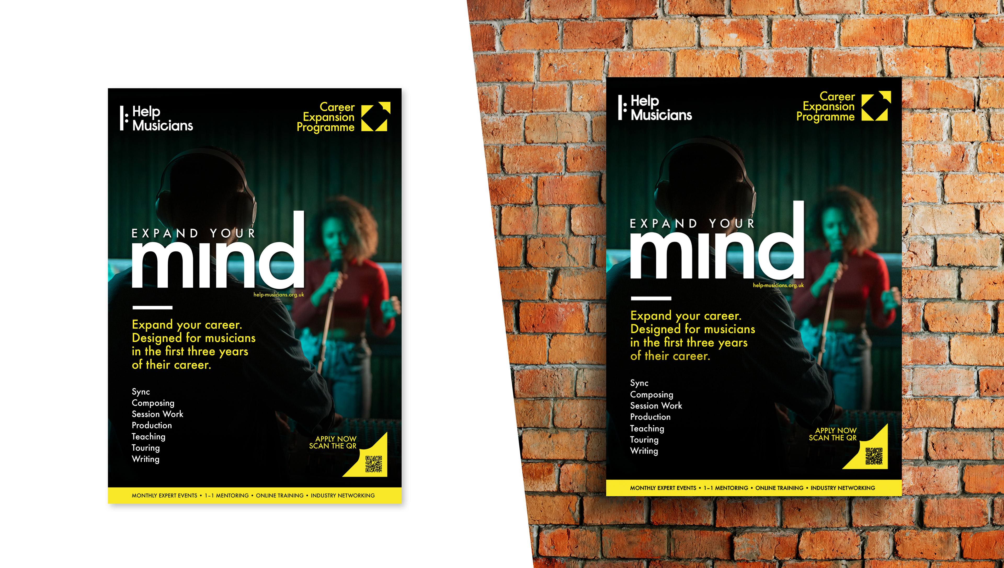
Visual Identity design for Help Musicians new service called Career Expansion Programme. It is designed to help musicians diversify their careers by teaching them about other areas of music and performance they could pursue alongside their current work. The programme includes monthly in-person speaking events with industry experts on sync, composing, and session playing; six mentoring sessions per participant; access to online webinars; monthly resources and guidance on musical careers; and a one-time in-person networking event.
C l i e n t —
Help Musicians
m y r o l e —
Visual Identity Design rolled out across our digital and offline channels.
m o r e i n f o —
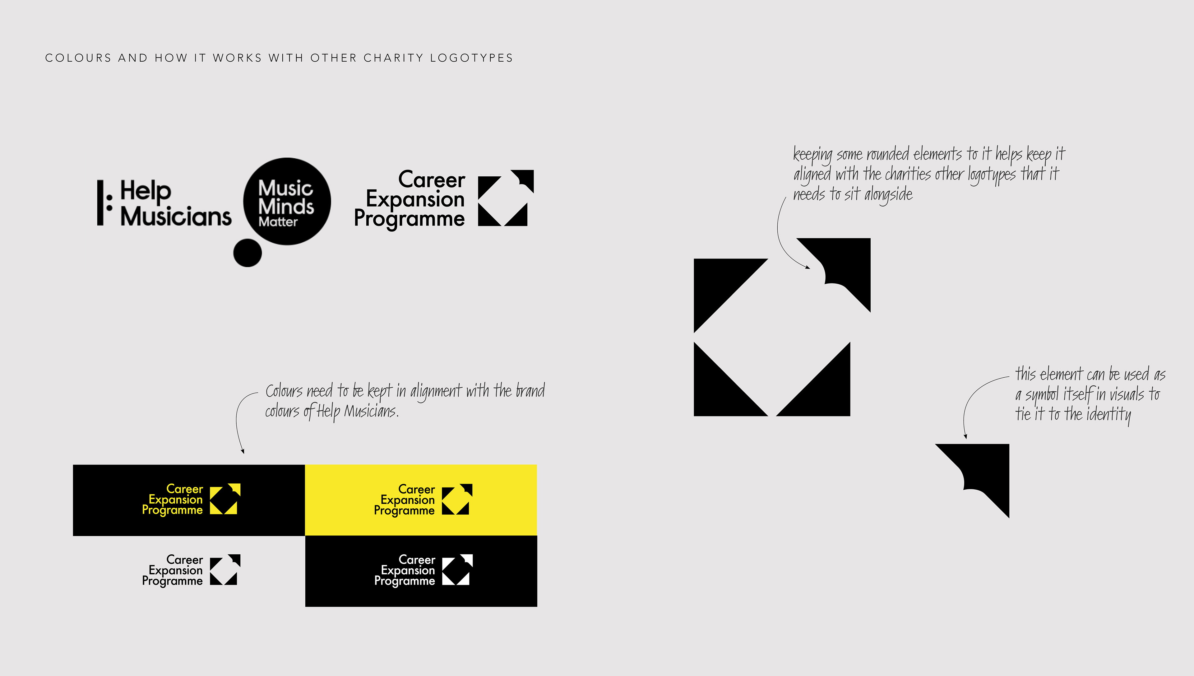
The programme should clearly sit within Help Musicians’ wider brand but have its own identity that enables it to stand out and appear unique amongst our other service offers.
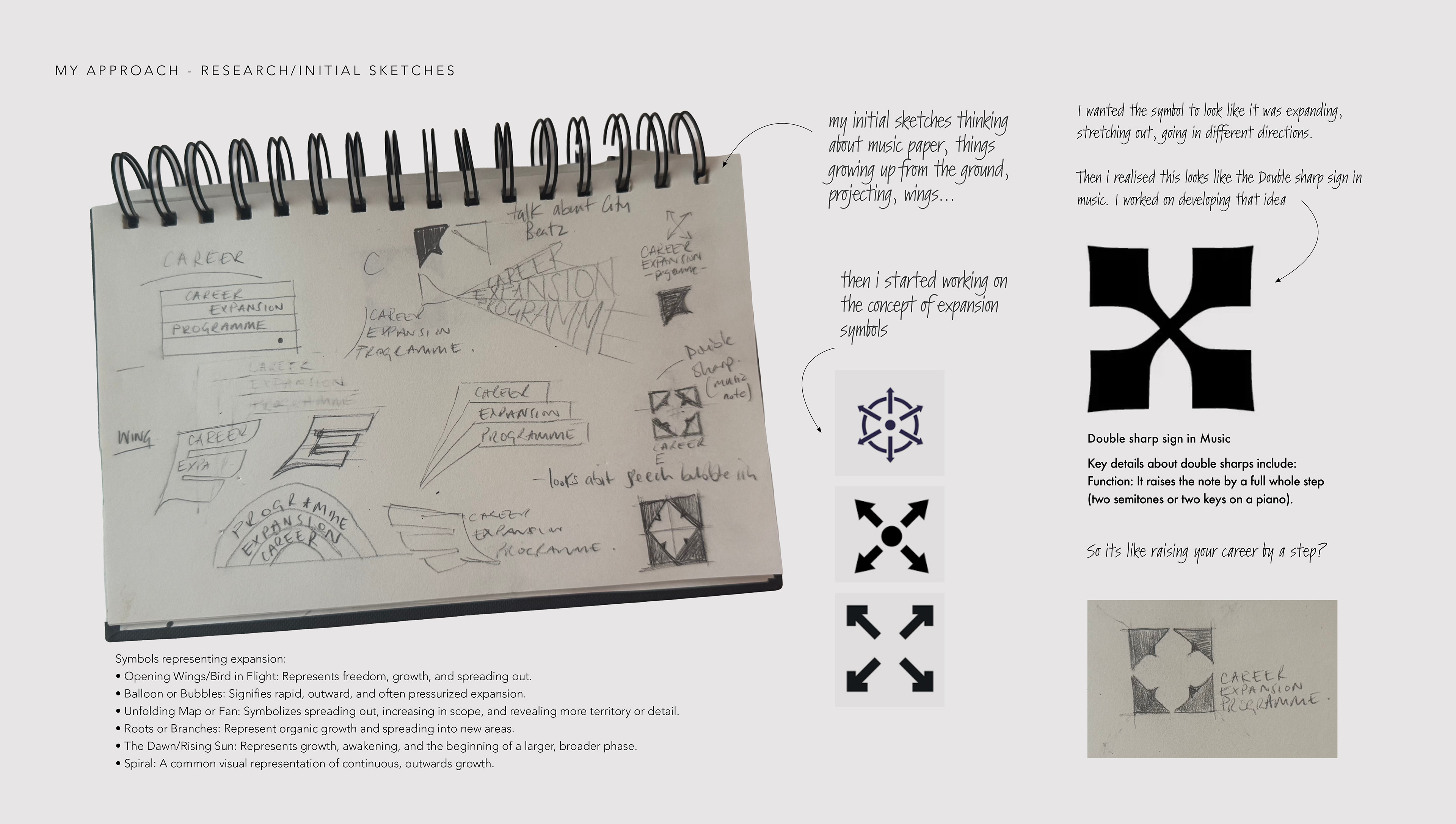
I began developing the identity for my Career Expansion Project by exploring visual symbols that represent growth and outward movement, such as wings in flight, spirals, rising suns, and branching roots. These ideas helped me think about expansion not just as something physical, but as a sense of progress, freedom, and reaching into new areas.
In my initial sketches, I experimented with forms associated with music, such as manuscript paper, alongside imagery of shapes growing upward from the ground or projecting outward. This stage was about exploring direction and movement, trying to capture the feeling of something evolving and spreading.
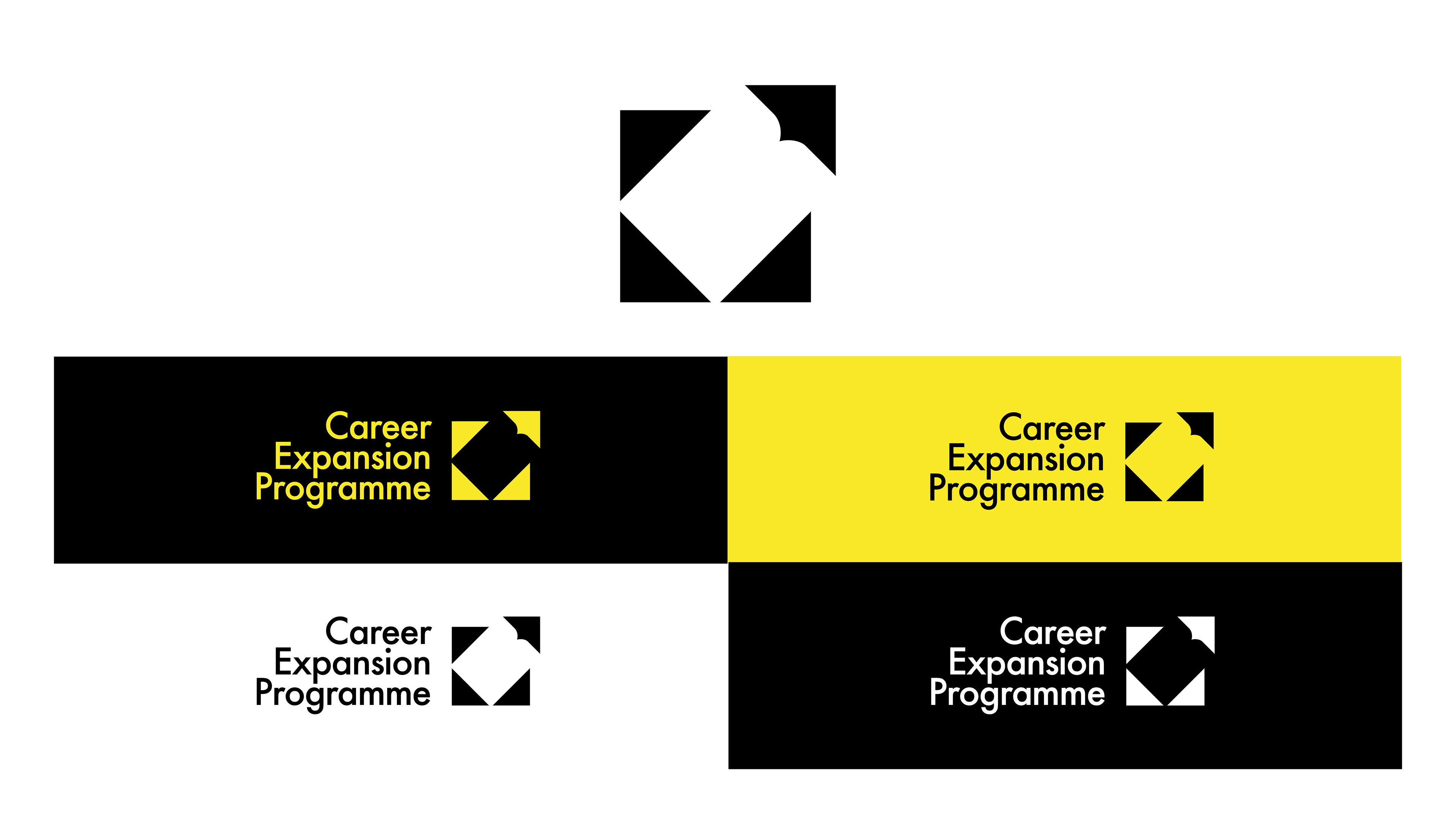
I then focused more clearly on the idea of expansion itself, aiming to create a symbol that appeared to stretch and extend in multiple directions. During this process, I realised that one of my designs resembled the double sharp symbol in music, which raises a note by a whole step. This felt like a strong conceptual link—visually and metaphorically suggesting the idea of elevating or advancing a career.
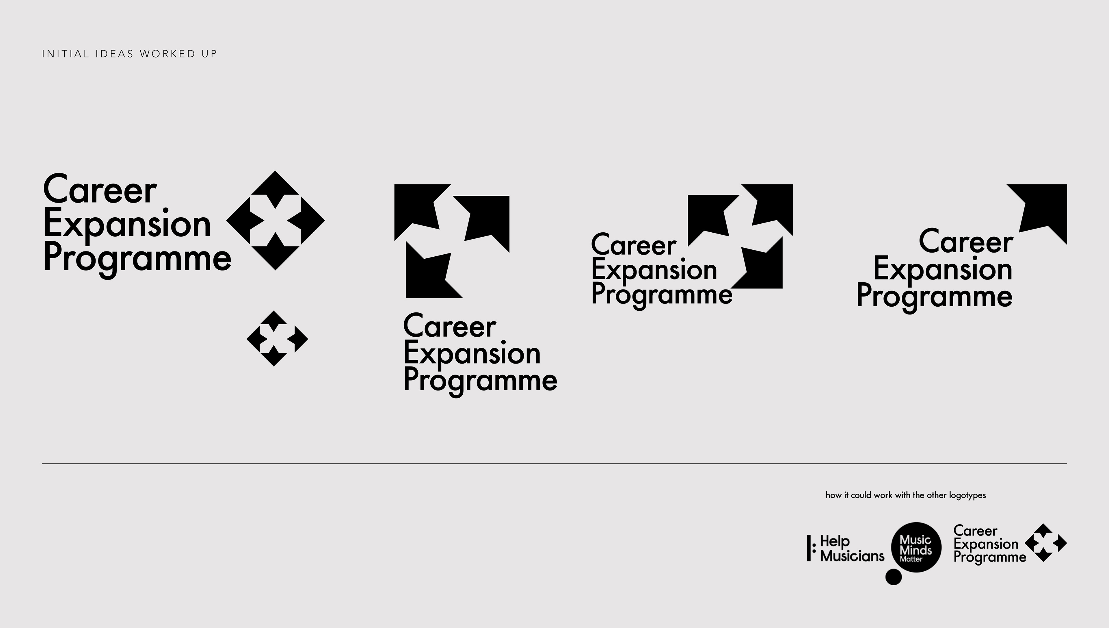
From there, I refined the concept into a final symbol, ensuring it remained dynamic while also fitting alongside the existing Help Musicians logotypes. I kept some rounded elements to maintain consistency with the wider brand and considered how parts of the symbol could be used independently across different visuals. Throughout the process, I also ensured the colours remained aligned with the established Help Musicians brand identity.