C l i e n t — c o m i c r e l i e f
w h a t t h e y d o — Comic Relief is a UK charity that raises money to tackle poverty and social injustice in the UK and around the world. Through fundraising campaigns and strategic grant-making, the organisation supports projects that create lasting social change

o v e r v i e w —
I designed Comic Relief's Annual Report, transforming complex financial information, impact data and organisational updates into a clear, engaging publication. The report needed to communicate a large volume of information while remaining accessible, visually engaging and consistent with the Comic Relief brand. Comic Relief publishes annual reports to communicate its impact, financial performance and strategy to supporters and stakeholders.
D E L I V E R A B L E S —
Report Design . Information Design . Data Visualisation

c h a l l e n g e —
The challenge was to transform a detailed annual report into an engaging editorial publication that was easy to navigate and enjoyable to read. Large volumes of financial information, statistics and written content needed to be organised into a clear visual hierarchy while remaining fully aligned with Comic Relief's established brand identity.


r e s e a r c h a n d i n s p i r a t i o n —
Research explored annual reports from charities and corporate organisations alongside examples of contemporary editorial and information design. Particular attention was given to typography, grid systems, data visualisation and page hierarchy to understand how complex information could be communicated in a clear, engaging and accessible way.
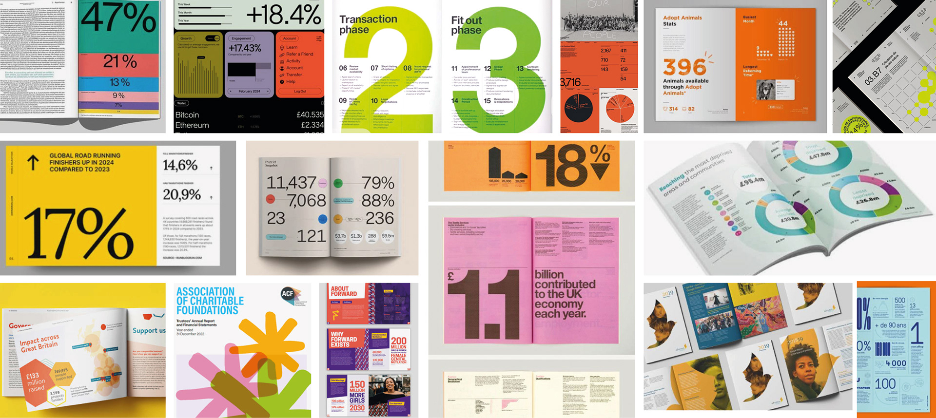
Research into editorial design, annual reports and information graphics informed a clear visual hierarchy that balanced readability with engaging storytelling.

c o n c e p t d e v e l o p m e n t —
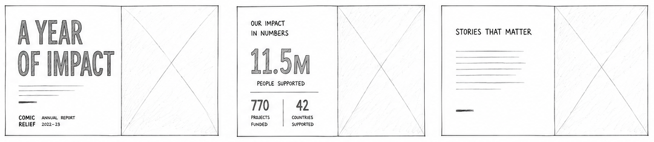
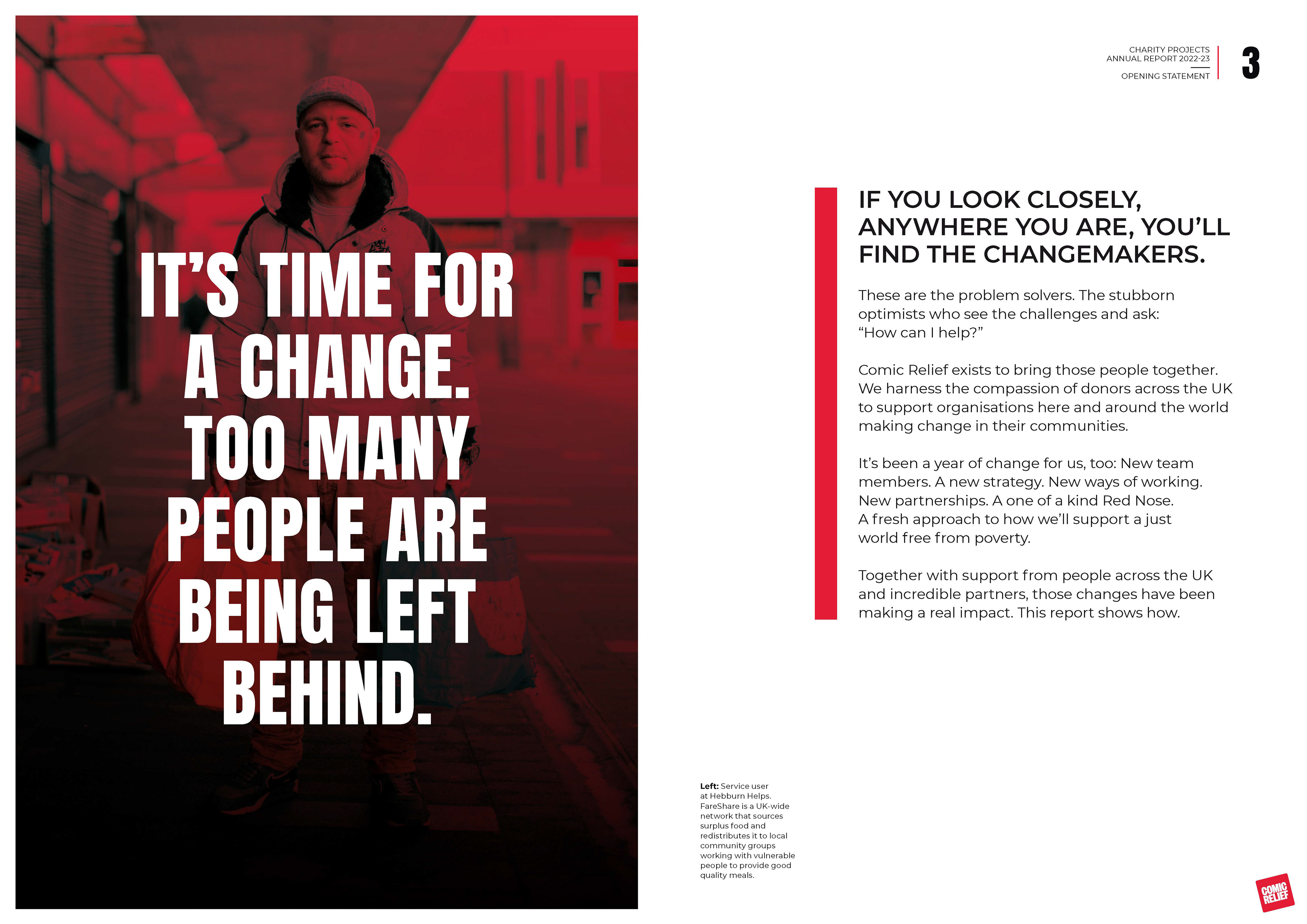
r o u t e o n e — A bold editorial direction using large typography and vibrant layouts to create impact while improving the readability of lengthy reports.

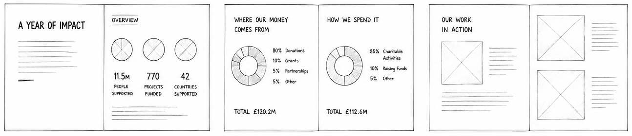
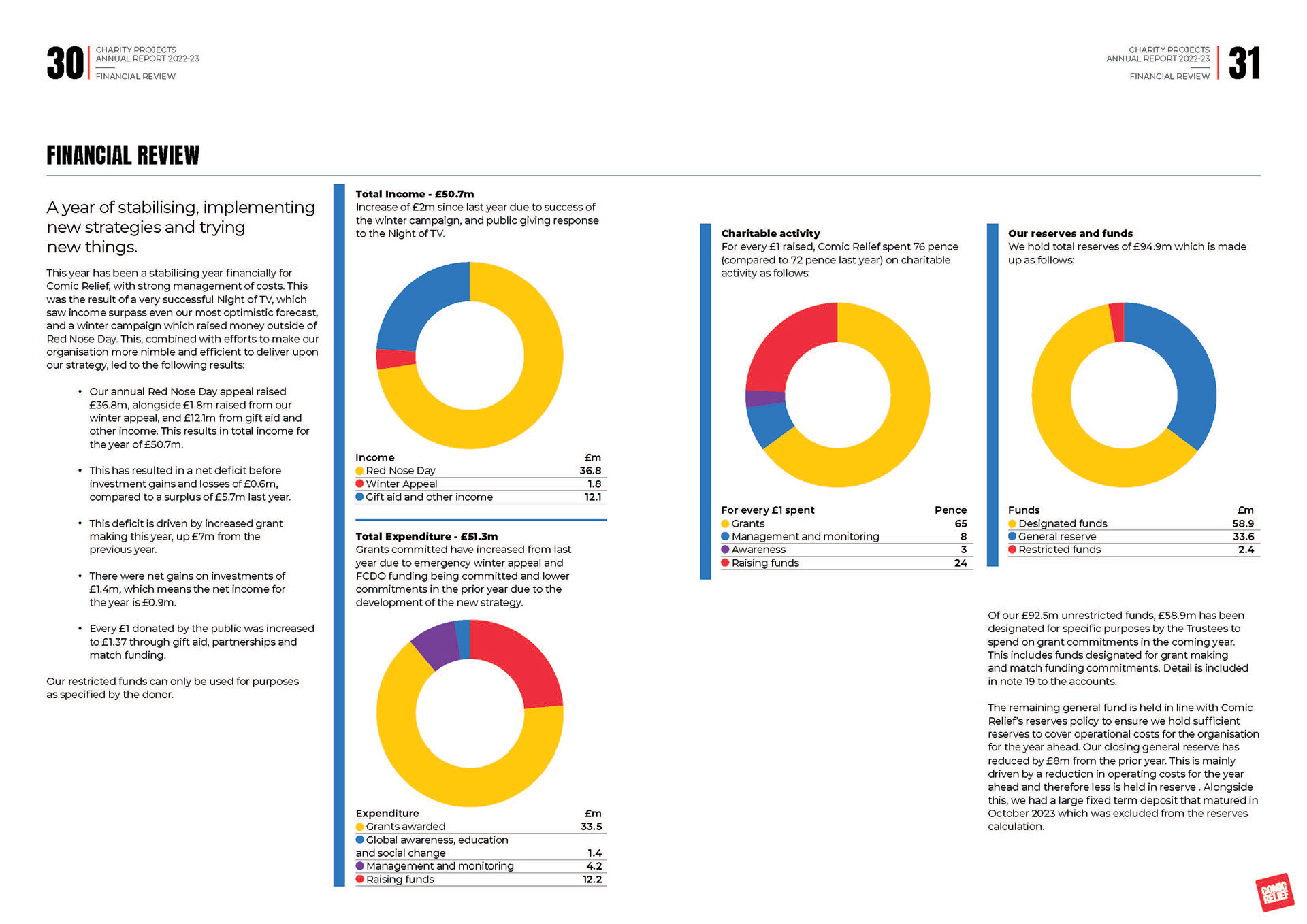
r o u t e t w o — A more structured approach that introduced stronger grid systems and information graphics, helping readers navigate financial data and key statistics more intuitively.

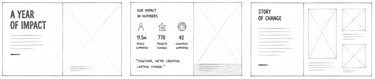
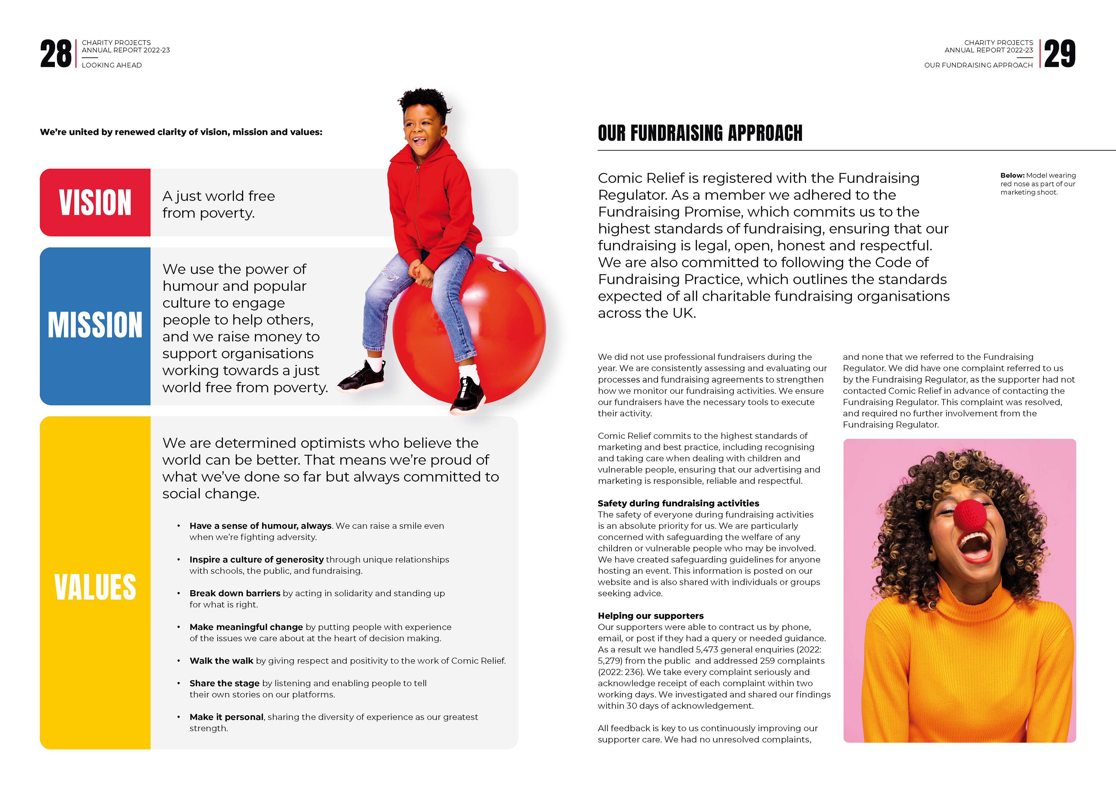
r o u t e t h r e e — The final concept refined these ideas into a cohesive editorial system, balancing bold visual moments with clean layouts to improve accessibility and consistency throughout the publication.

f i n a l P U B L I C A T I O N —
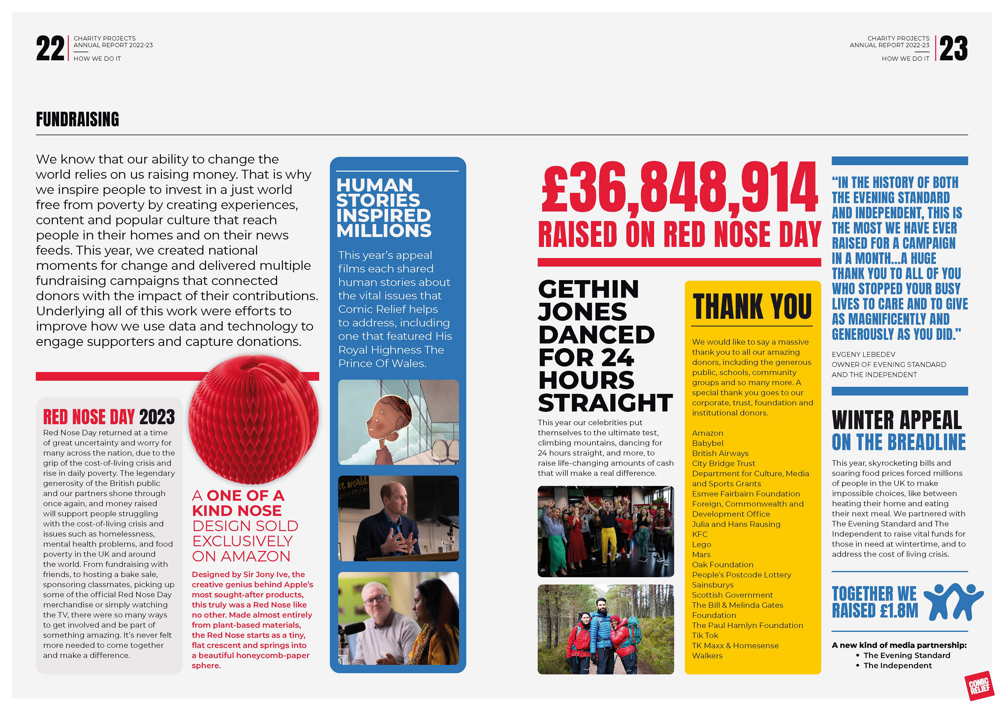
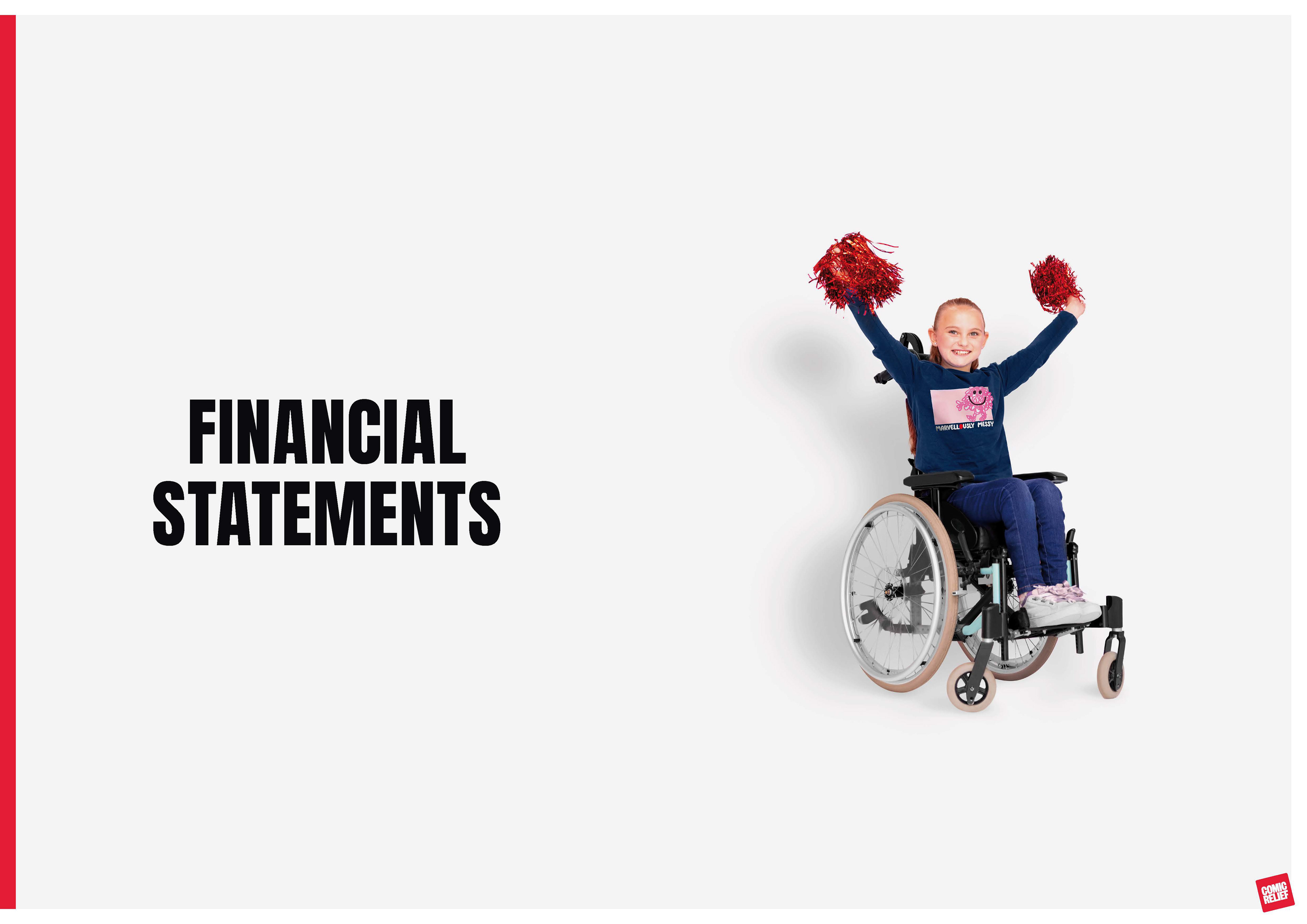
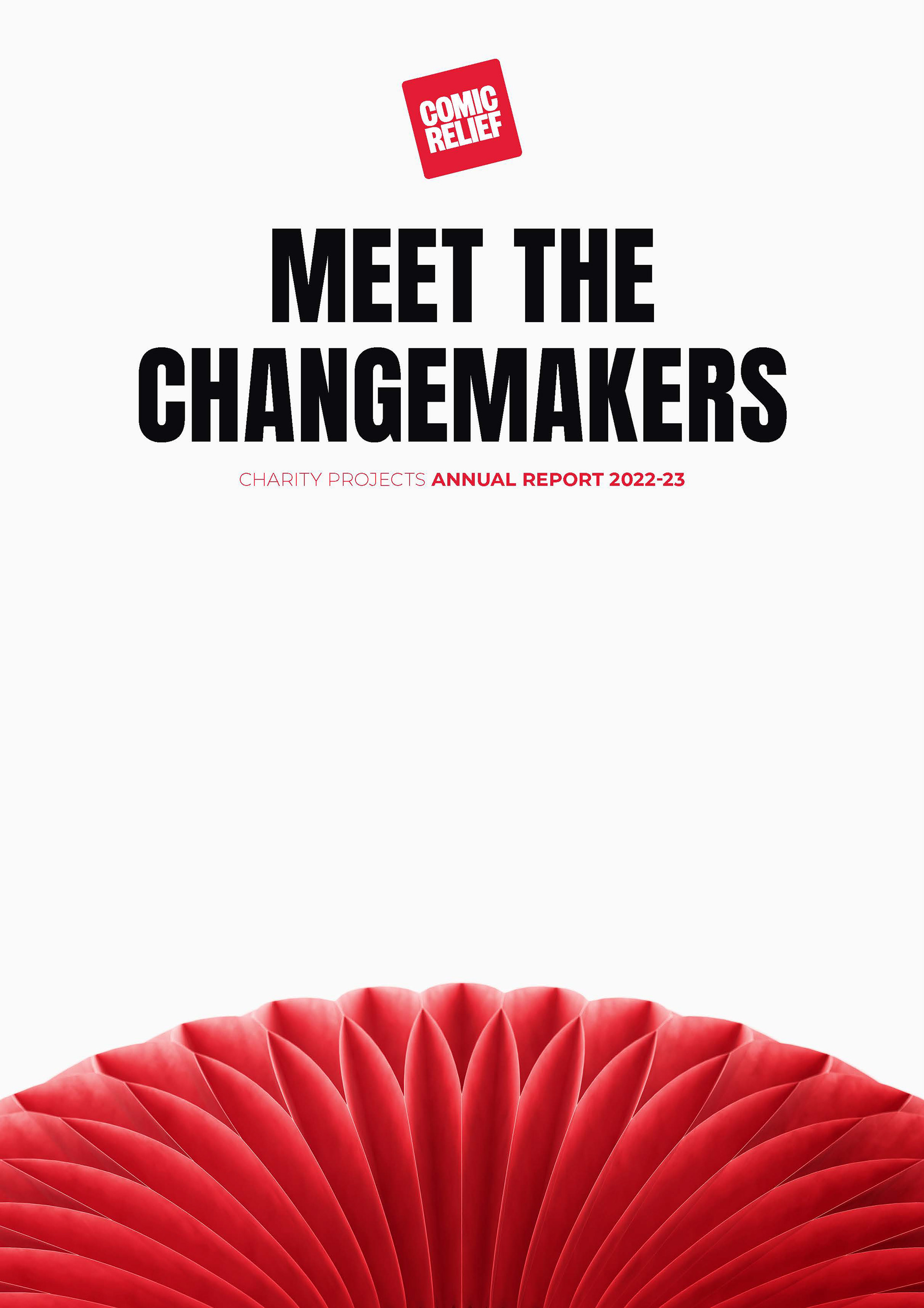
The final design transformed the annual report into a clear, engaging publication that balanced storytelling with complex information. The newly introduced concertina Red Nose helped establish a fresh visual direction, reflecting a new chapter for Comic Relief while remaining rooted in the charity's recognisable identity. A flexible editorial system combined photography, typography and infographics to guide readers through financial data, organisational updates and impact stories without overwhelming the content. Working within Comic Relief's established brand ensured the publication felt both familiar and contemporary, improving clarity, accessibility and reader engagement.

i n f o r m a t i o n d e s i g n —
Infographics, icons and carefully considered layouts were used to simplify complex statistics and financial information, making key messages easier to understand at a glance while maintaining accuracy and consistency.
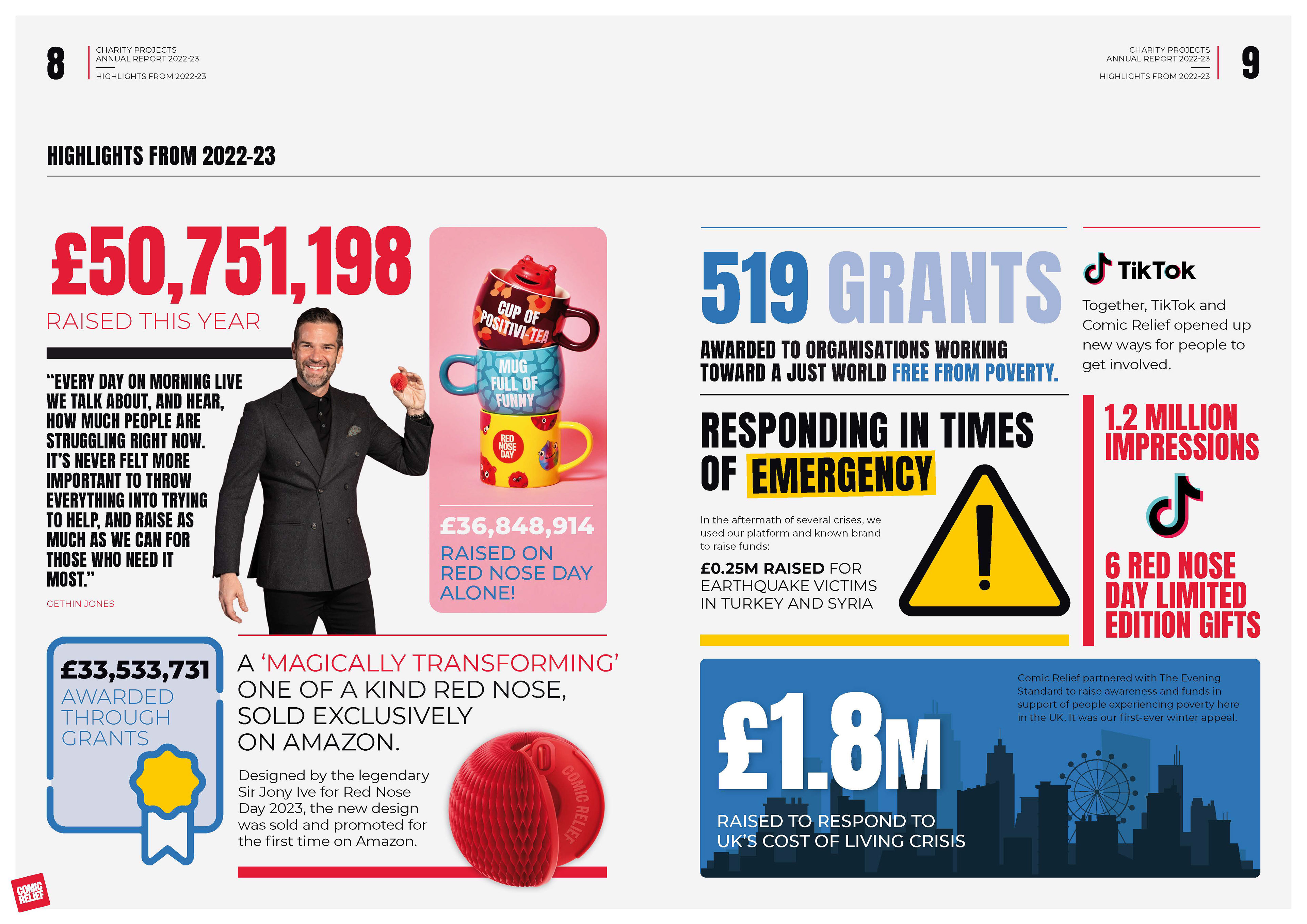
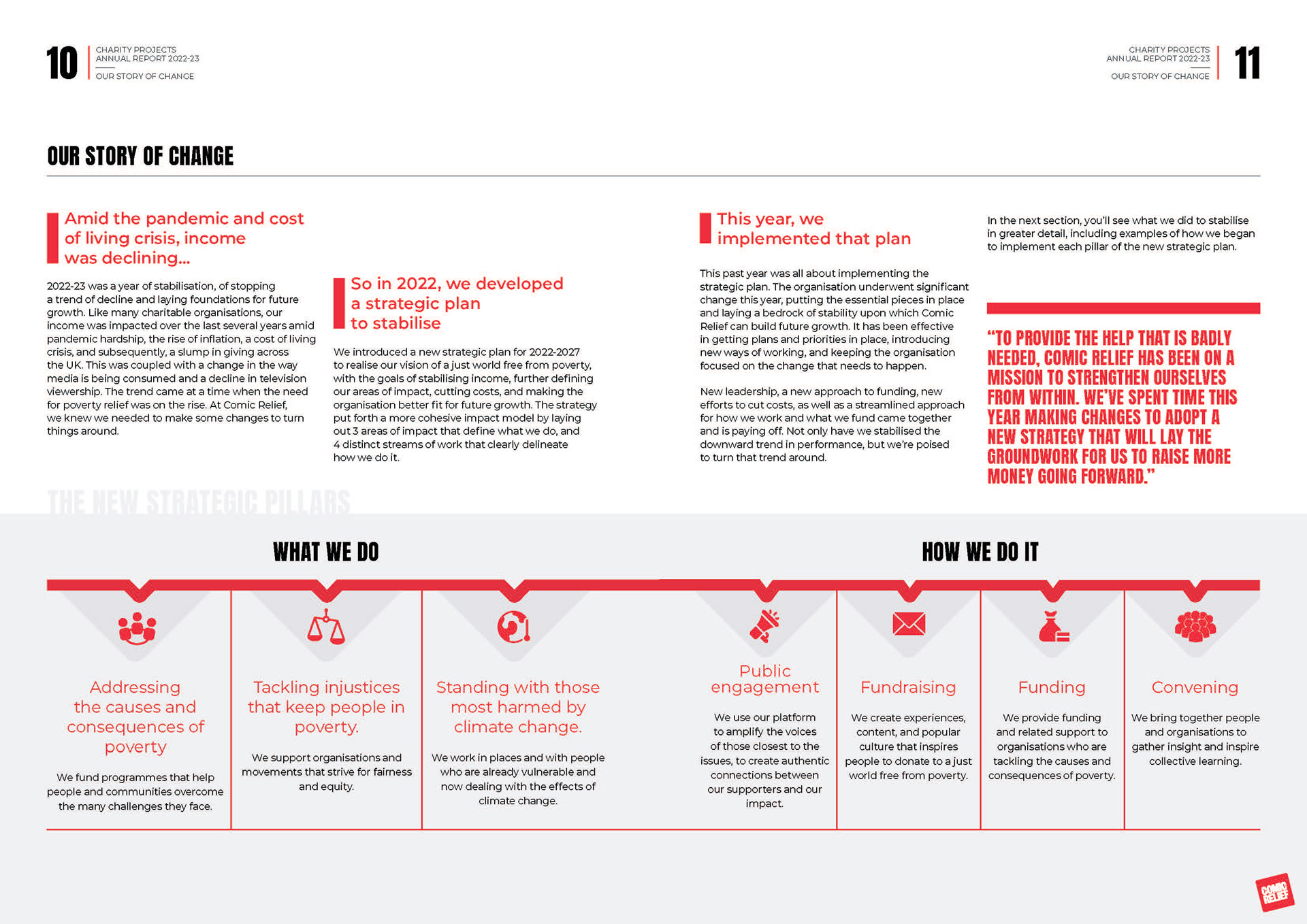
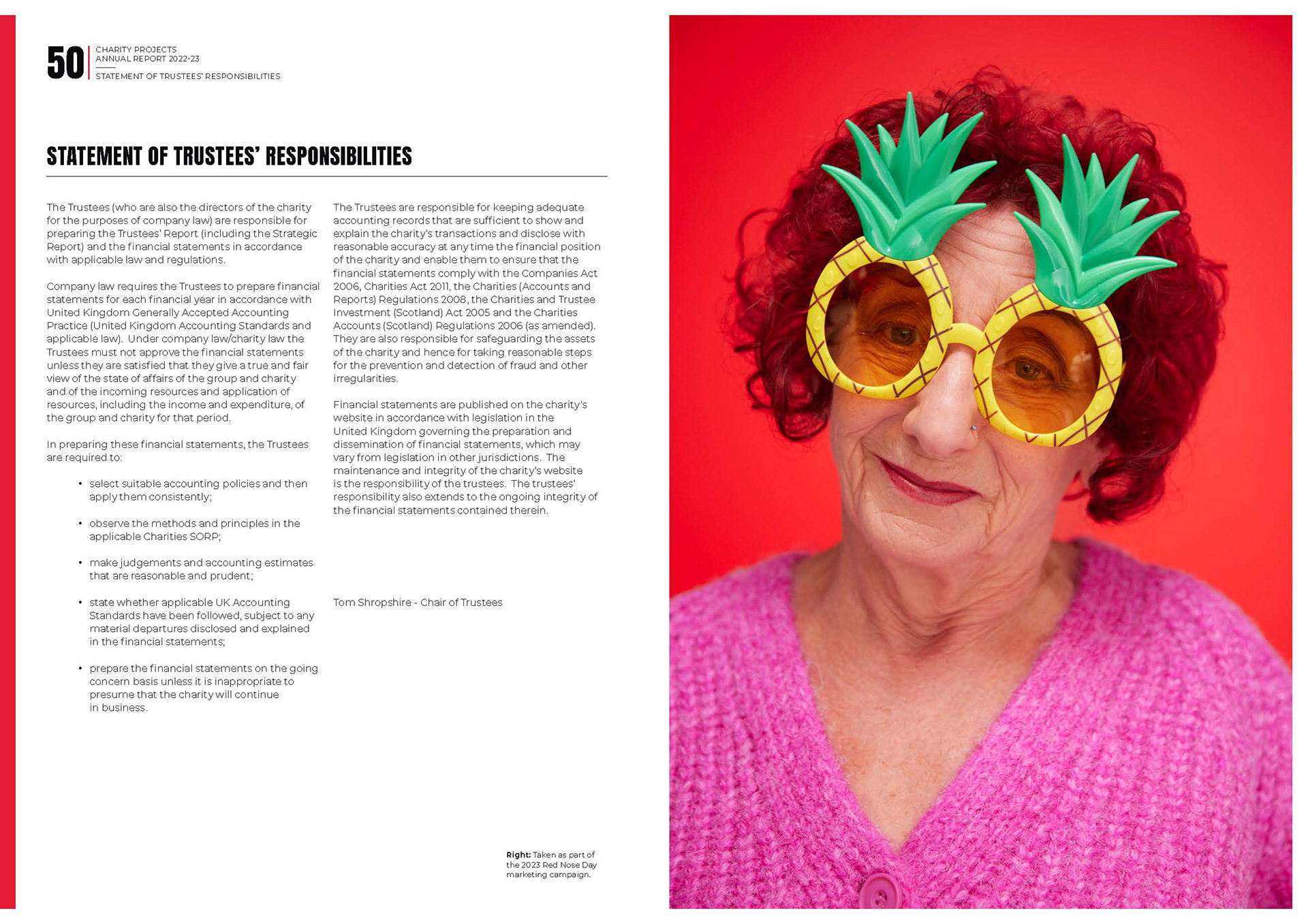
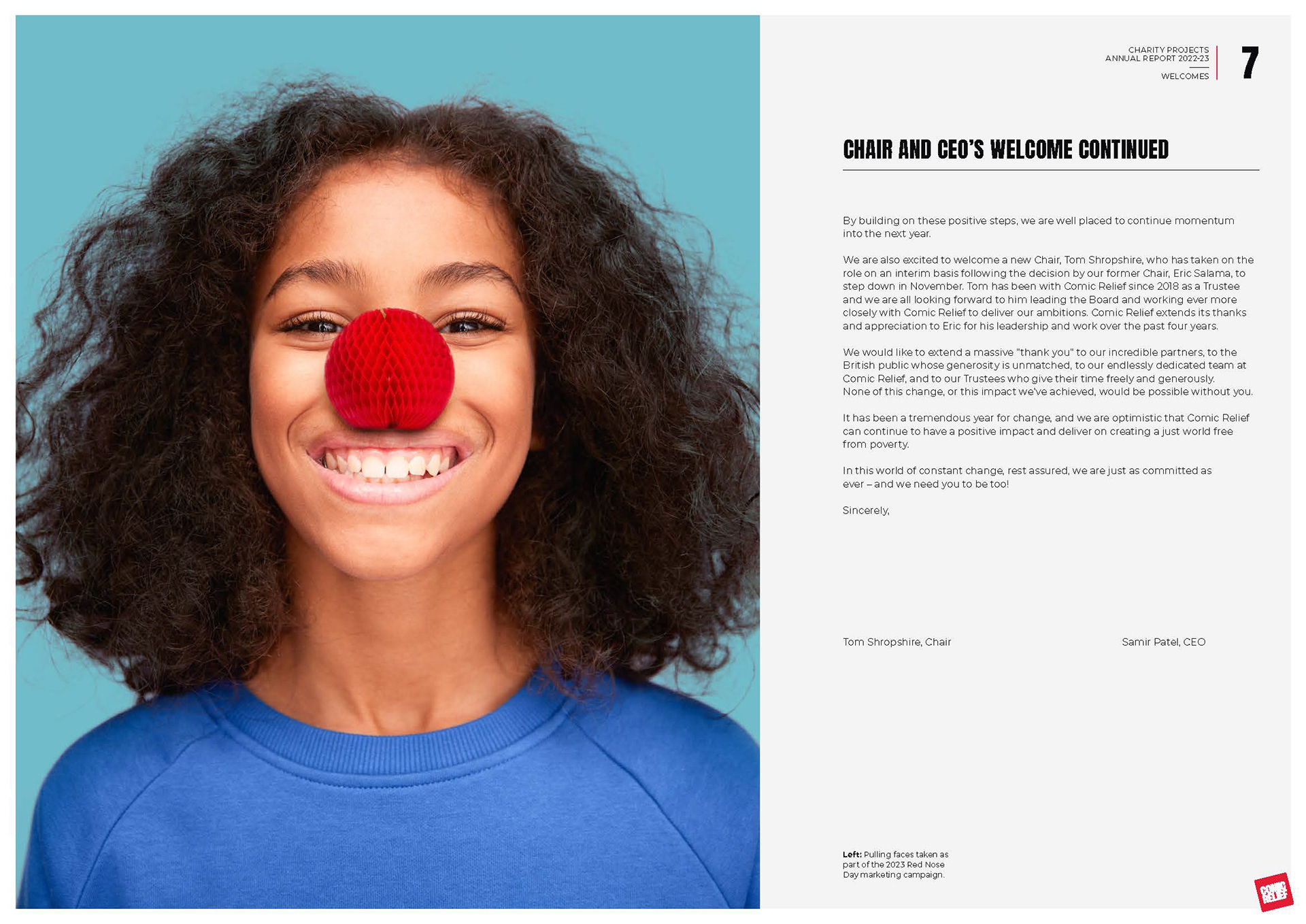
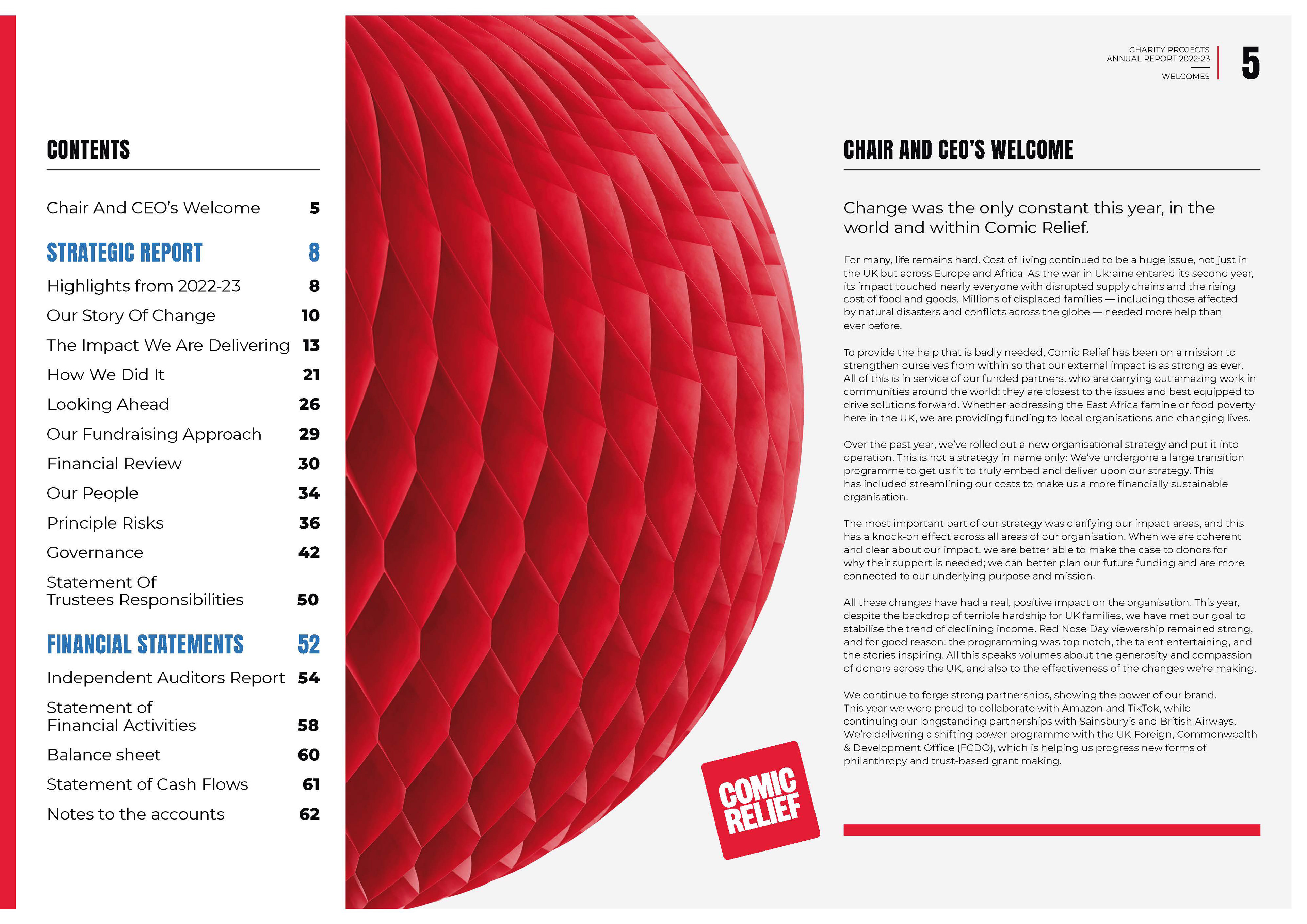
Complex information was transformed into an accessible editorial experience through clear hierarchy, thoughtful layouts and engaging data visualisation.