C l i e n t — B B C C H I L D R E N I N T H E N E E D
(In collaboration with Rankin and Photobox)
w h a t t h e y d o — BBC Children in Need is a UK charity that provides funding and support to projects helping children and young people facing disadvantage. Through fundraising campaigns, partnerships and grants, the charity supports organisations that improve the lives of children across the UK.

o v e r v i e w —
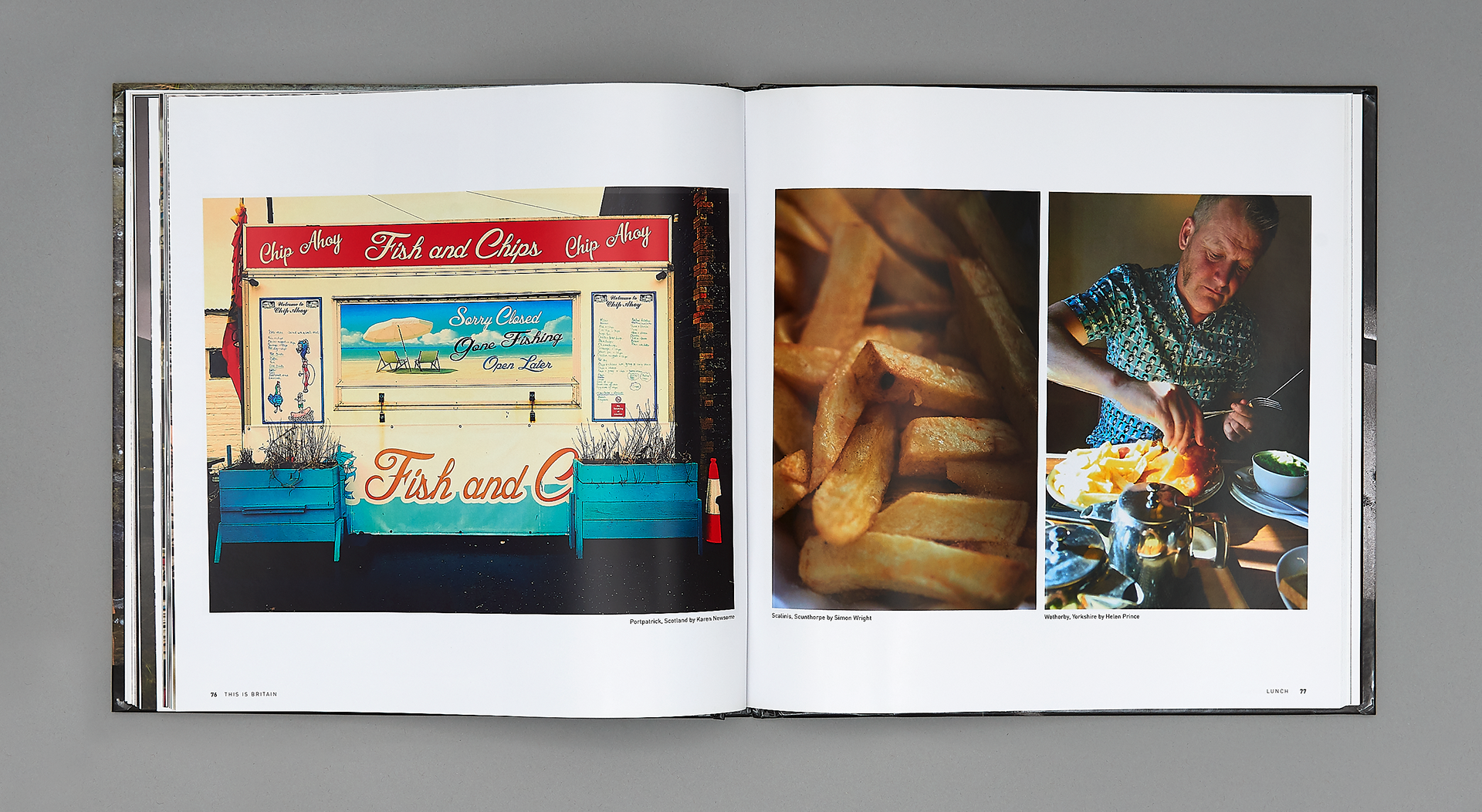
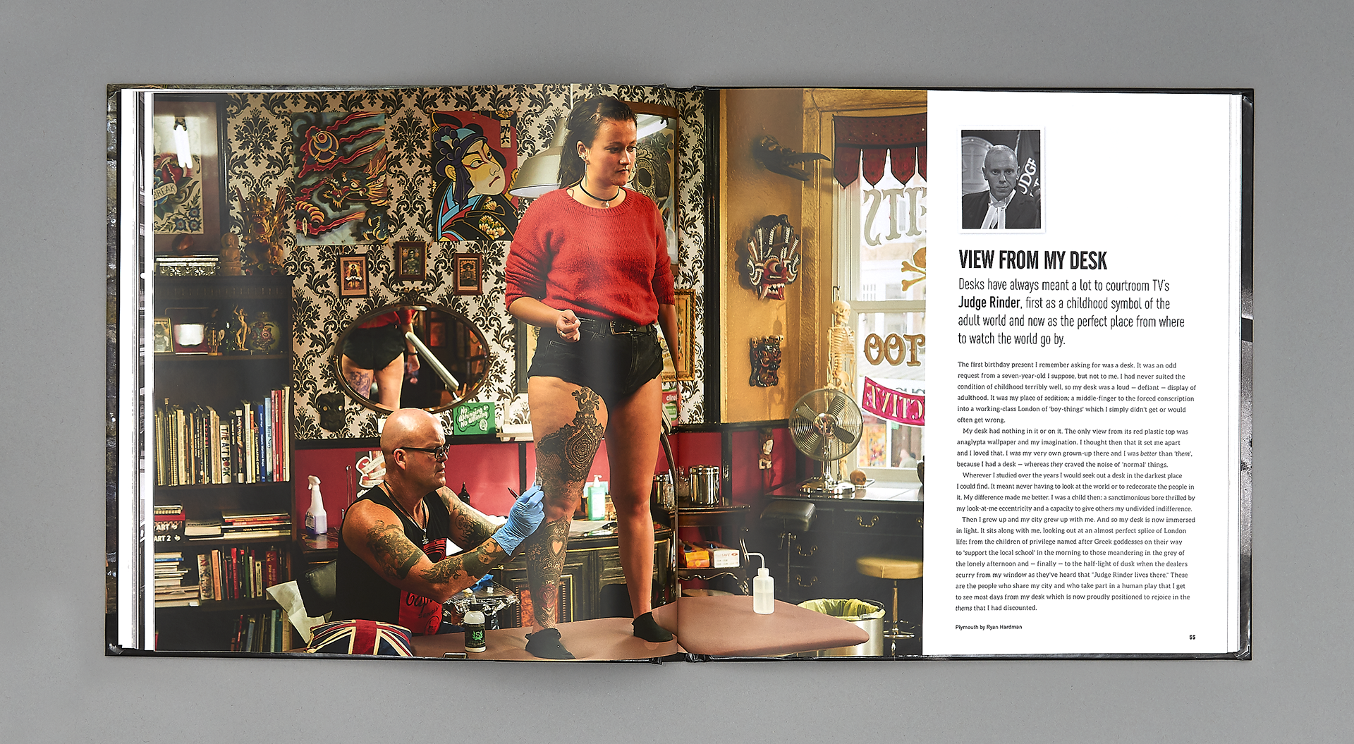
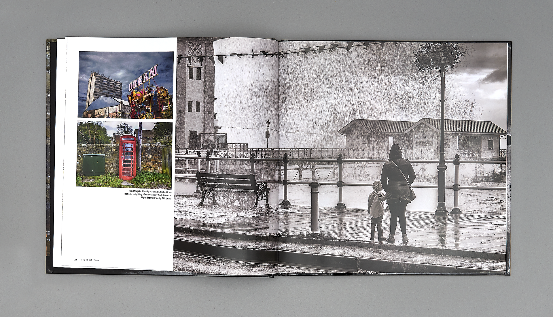
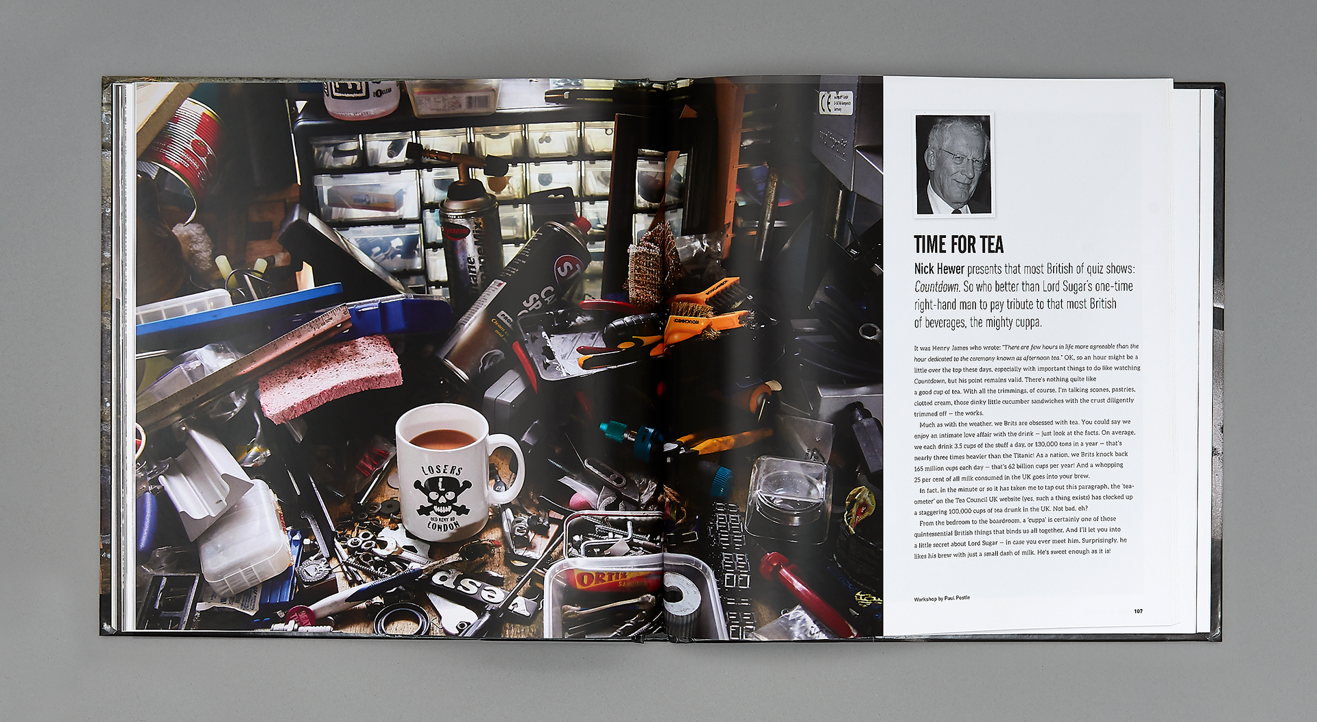
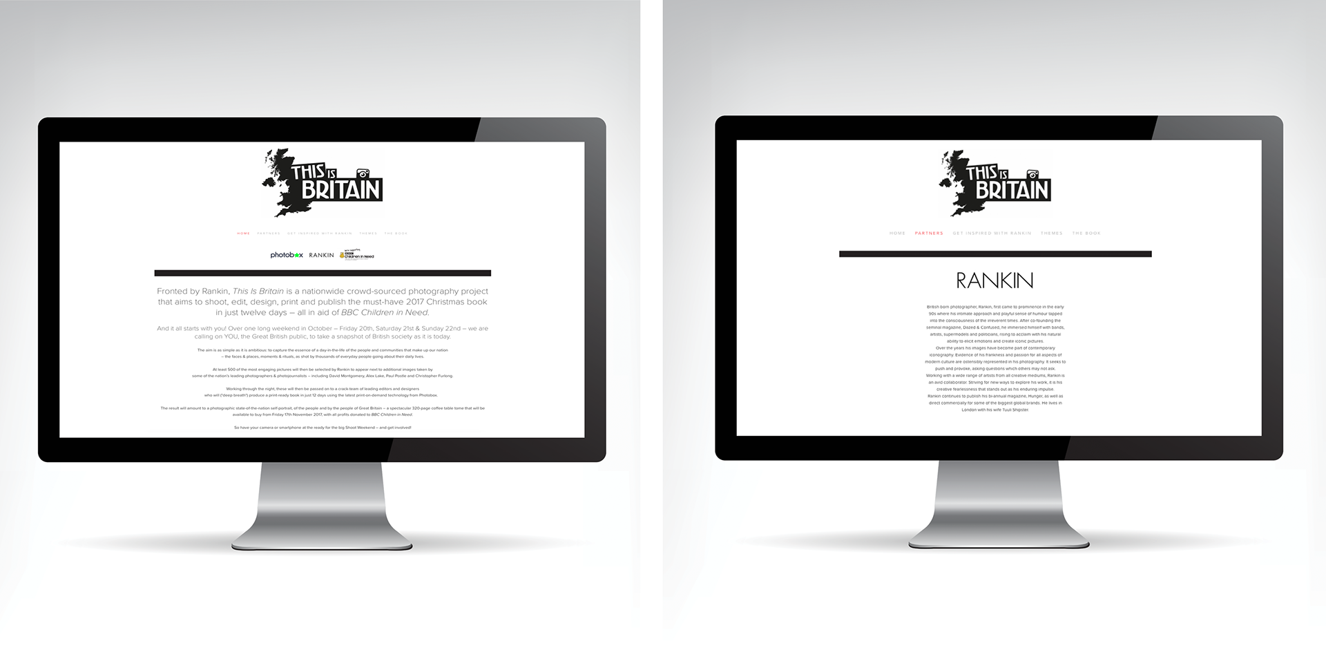
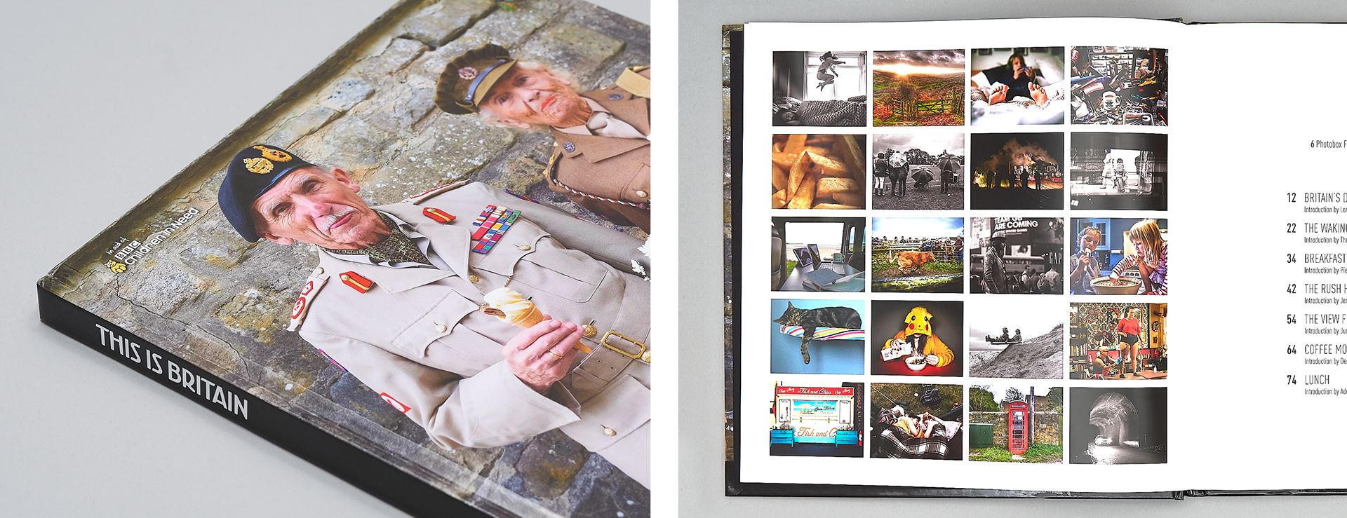
I developed the visual identity and editorial design for This Is Britain, a charitable photography book created in collaboration with Rankin, Photobox and BBC Children in Need. The project celebrated contemporary Britain through photography submitted by the public, with all proceeds supporting BBC Children in Need. The identity was applied across the book, promotional materials and digital communications.
D E L I V E R A B L E S —
Brand Identity . Editorial Design . Art Direction . Print Design

c h a l l e n g e —
The challenge was to create an identity that celebrated modern Britain while allowing the photography to remain the primary focus. The visual language needed to feel timeless, inclusive and recognisable, working consistently across the book cover, chapter openers, promotional materials and the project's digital presence.

r e s e a r c h a n d i n s p i r a t i o n —
Research explored contemporary editorial design, photography publications and cultural publications to understand how typography and layout could complement rather than compete with powerful imagery. The work also considered how a simple, flexible identity could unify a diverse collection of photographs while reflecting the inclusive nature of the project.
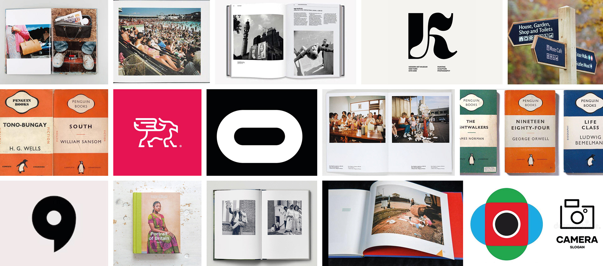
Research explored editorial design, photography publications and visual references celebrating British culture, informing a clean, understated identity that allowed the photography to remain the focus of the publication.

c o n c e p t d e v e l o p m e n t —
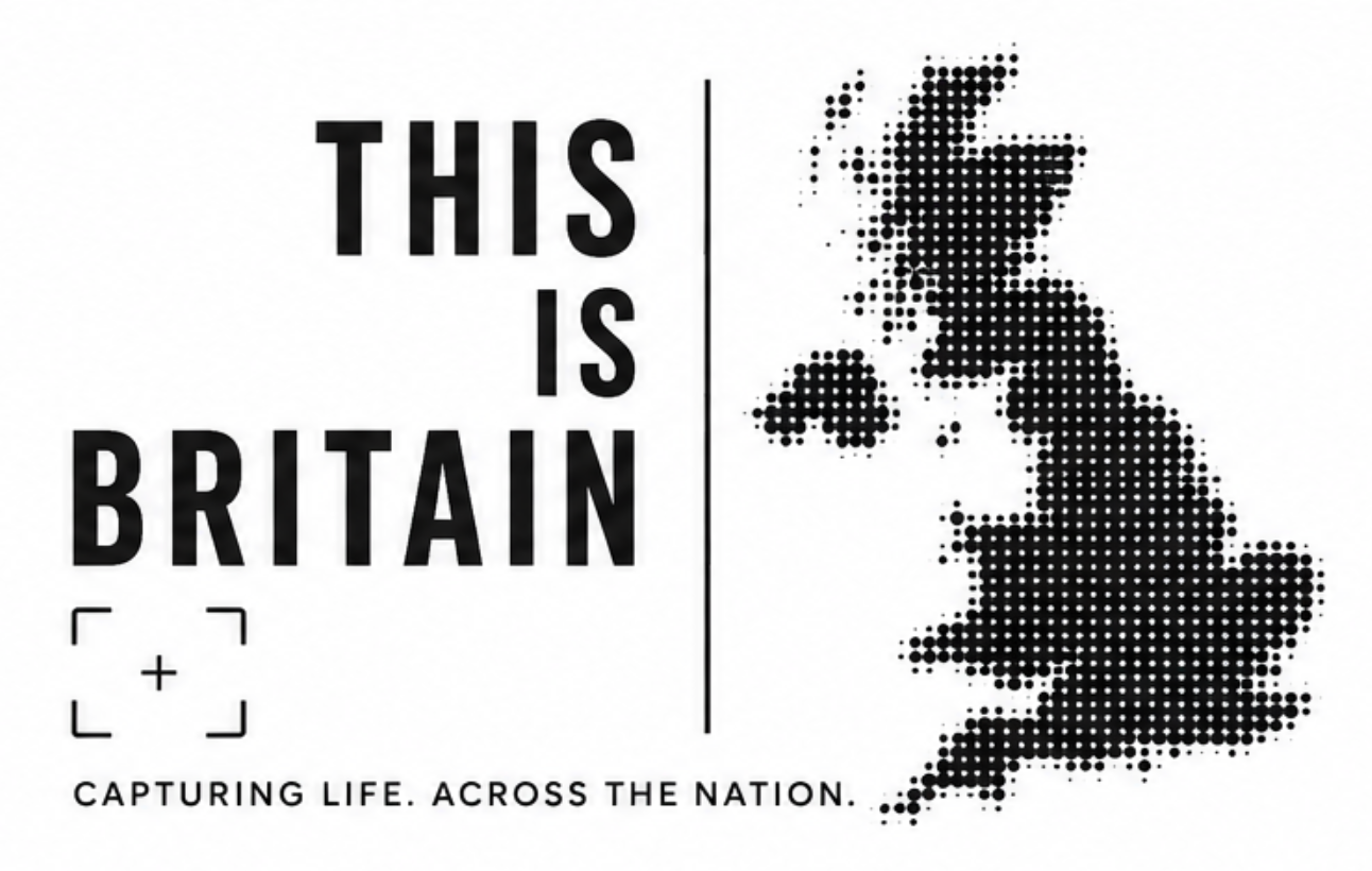
r o u t e o n e — This concept combined bold typography with a stylised map of Britain, immediately communicating the project's national focus. The halftone effect referenced photography and print, while the clean layout created a strong editorial identity that celebrated the diversity of Britain through imagery.

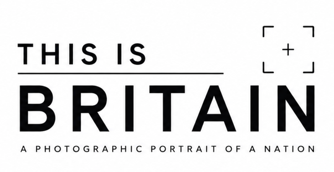
r o u t e t w o — This concept explored a clean, typographic identity inspired by contemporary editorial design. The minimalist layout and viewfinder symbol subtly referenced photography, creating a modern, understated identity that allowed the imagery to remain the primary focus.

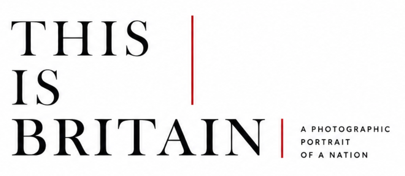
r o u t e t h r e e — This concept took inspiration from premium editorial publications, using elegant typography and a refined layout to communicate the project's cultural significance. The minimalist approach created a timeless identity that positioned This Is Britain as a high-quality photography publication while allowing the imagery to take centre stage.

f i n a l i d e n t i t y —
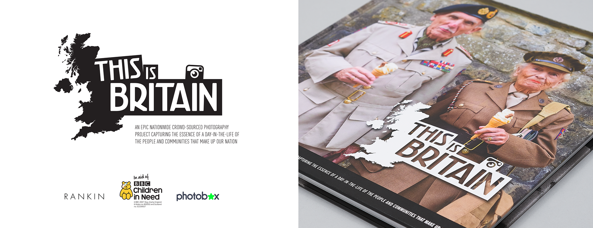
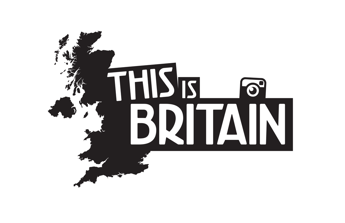
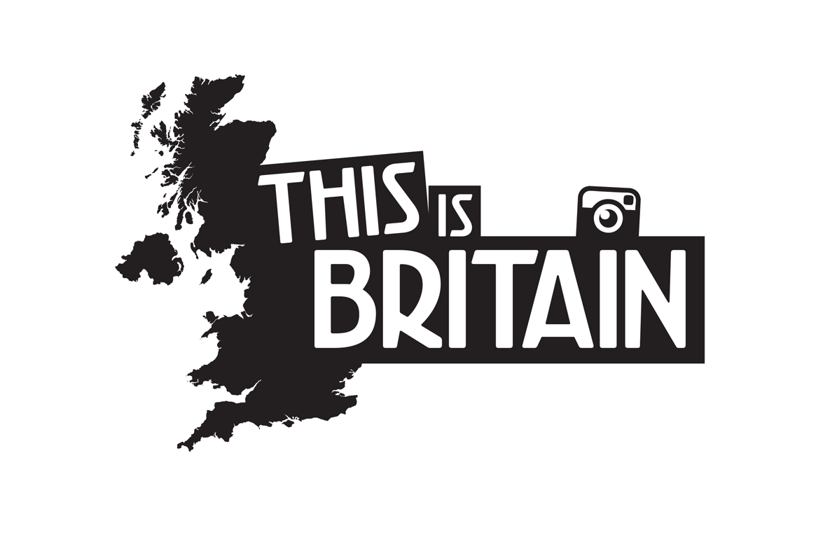
The final concept combined the strongest aspects of the previous routes into a single, cohesive identity. Earlier concepts felt either too understated or lacked a distinctive visual element, whereas the final direction balanced bold typography with an iconic silhouette of the UK to create an instantly recognisable brand. The addition of an Instagram-inspired camera symbol modernised the identity, appealing to a younger audience while reinforcing the project's photographic focus. Its compact composition also made it highly adaptable across social media, the book cover and campaign assets.

e d i t o r i a l c u r a t i o n —
Alongside developing the visual identity, I worked closely with Rankin and the BBC Children in Need team during the image selection process. Hundreds of submissions were reviewed and refined to create a balanced representation of contemporary Britain. As the publication developed, the editorial design remained flexible, allowing the layout to adapt as the final selection of images evolved.