C l i e n t — d e s i g n a t e ( f o r m a g i c b r e a k s )
w h a t t h e y d o — MagicBreaks is a UK travel company specialising in Disney holidays, short breaks and family travel experiences. The brand offers tailored holiday packages, accommodation and ticket options, helping customers plan memorable trips to destinations across the UK, Europe and beyond.
d e l i v e r a b l e s — Brand Refresh, Campaign Design, Art Direction, Print Design, Digital Design, Marketing Collateral
o v e r v i e w —
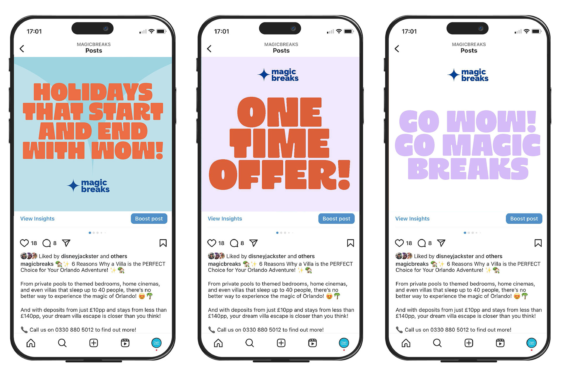
Commissioned by Designate, I developed a refreshed visual identity and campaign rollout for MagicBreaks. The aim was to evolve the brand into a more contemporary, versatile identity while maintaining its established connection to Disney holidays and supporting the company's broader range of travel offerings.
r e s e a r c h a n d i n s p i r a t i o n —
The existing MagicBreaks identity was reviewed to identify opportunities for modernisation while retaining key brand recognition. Research into competitor travel brands, vintage travel posters and current design trends informed the refreshed visual direction, exploring typography, colour, illustration and imagery. A key focus was reinterpreting the iconic star motif to feel fresh, distinctive and adaptable, while capturing the excitement and escapism of travel.

c o n c e p t d e v e l o p m e n t —
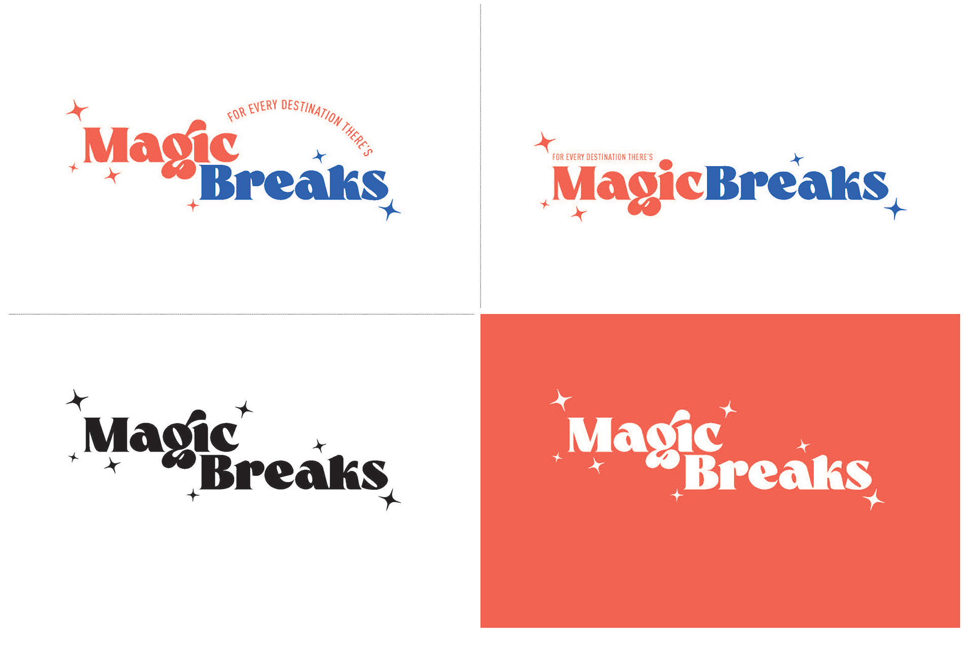
r o u t e o n e — Inspired by vintage travel posters, this concept paired a bold, rounded typeface with playful star motifs to create a modern yet nostalgic identity. The typography subtly referenced the character of classic Disney branding, while the curved strapline evoked the idea of a travel route, reinforcing the excitement and adventure behind every MagicBreaks holiday.

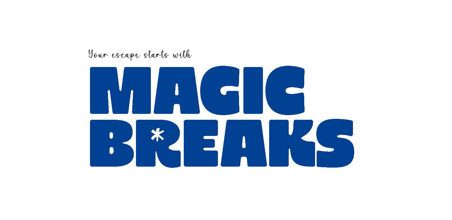
r o u t e t w o — This concept explored a bold, rounded typographic direction that gave the brand a confident yet approachable personality. The retained star motif was integrated into the wordmark, creating a simple focal point while preserving a connection to the existing MagicBreaks identity. The result was a modern, impactful logo with the flexibility to adapt across a wide range of campaign applications.

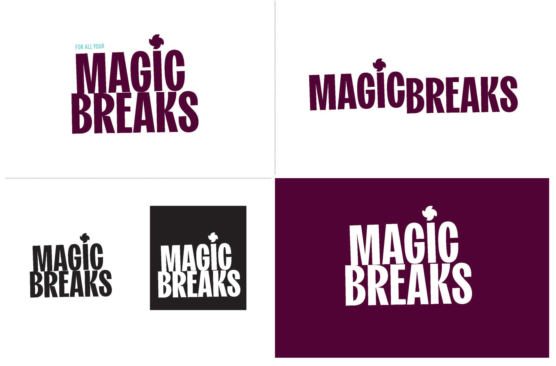
r o u t e t h r e e — The third concept took inspiration from classic travel luggage labels and vintage signage, using a tall condensed typeface to create a bold, confident identity. Retaining the recognisable star motif above the 'i', this direction captured a sense of heritage and adventure while offering a distinctive, impactful brand presence.


f i n a l i d e n t i t y —
The final identity evolved from the bold typographic concepts into a more flexible brand system. While the rounded display type brought confidence and personality to campaign messaging, it became clear that the logo required a simpler, more scalable solution for use across a wide range of applications.
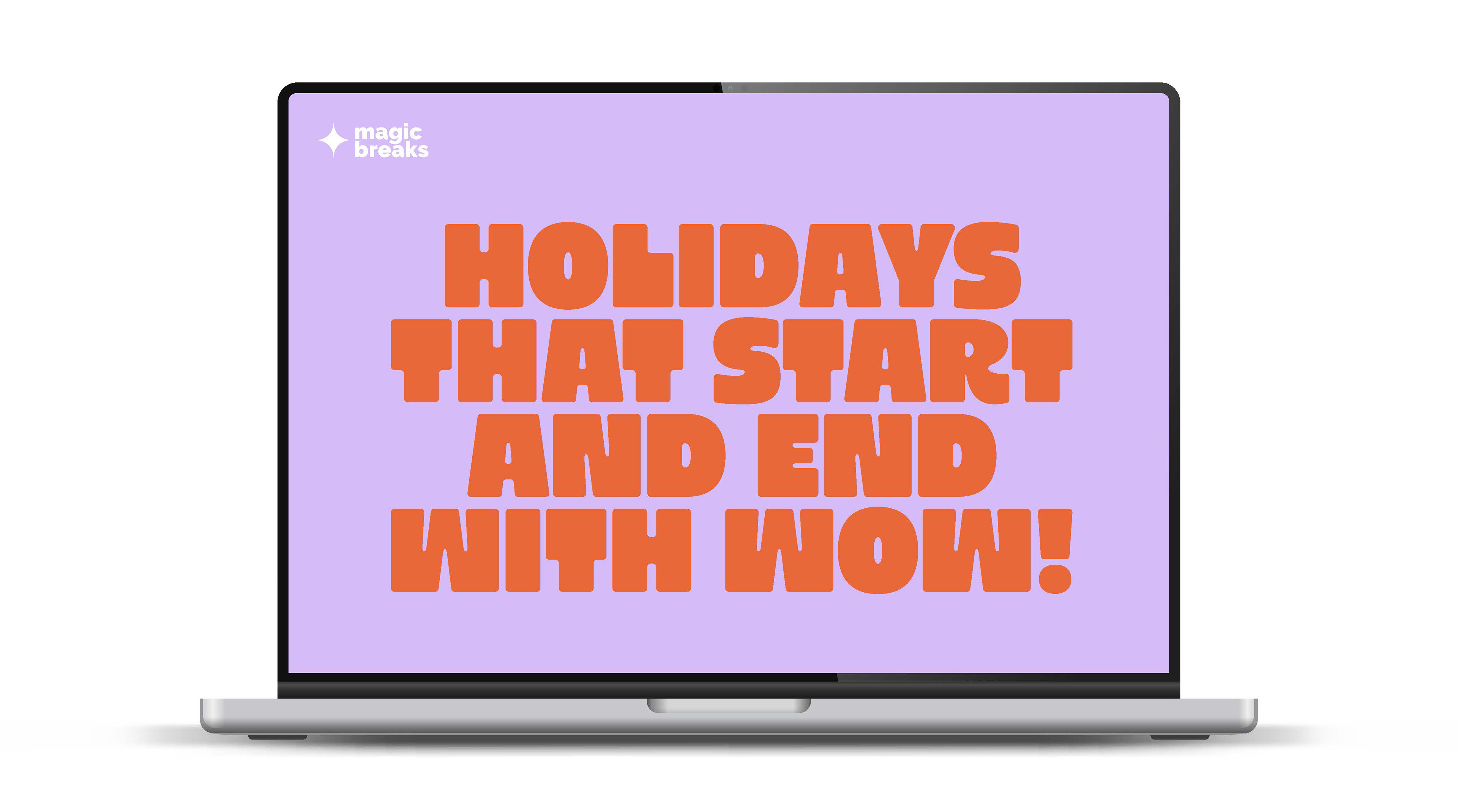
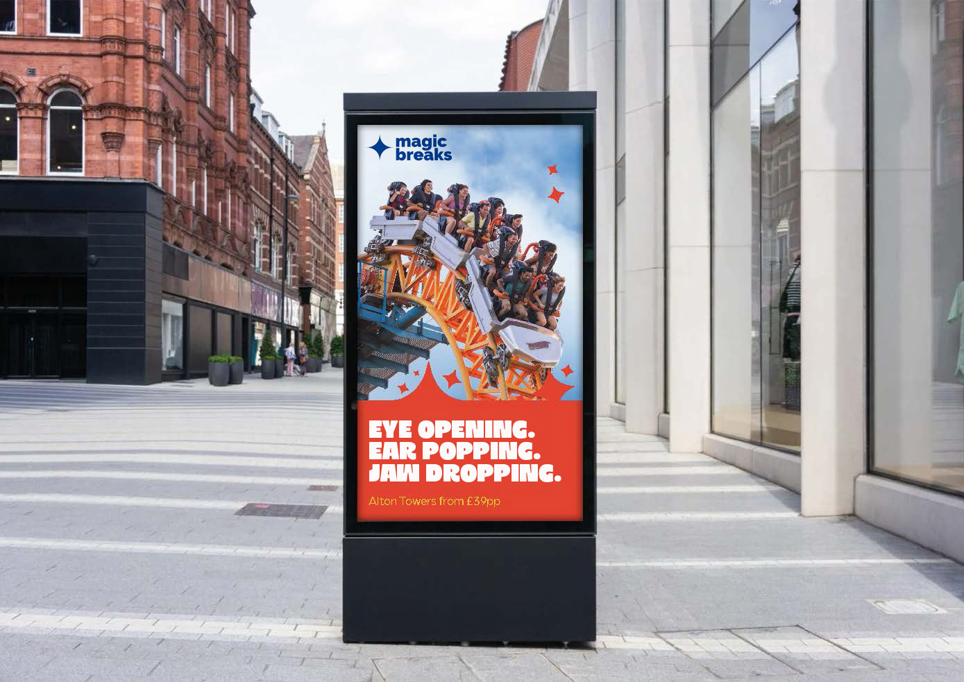
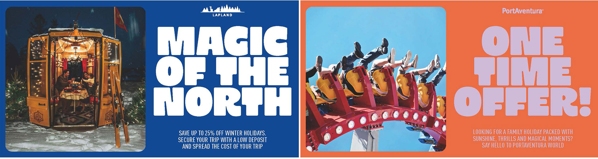
The star motif was refined into a standalone symbol, creating a distinctive brand mark that retained a visual connection to the original MagicBreaks identity while feeling cleaner and more contemporary. Paired with a modern sans-serif wordmark, the final logo balanced warmth, clarity and versatility, allowing it to work confidently across digital, print and large-scale campaign assets. The bold display typography was retained as a complementary headline style, giving the brand an expressive voice while ensuring consistency throughout the wider visual identity.


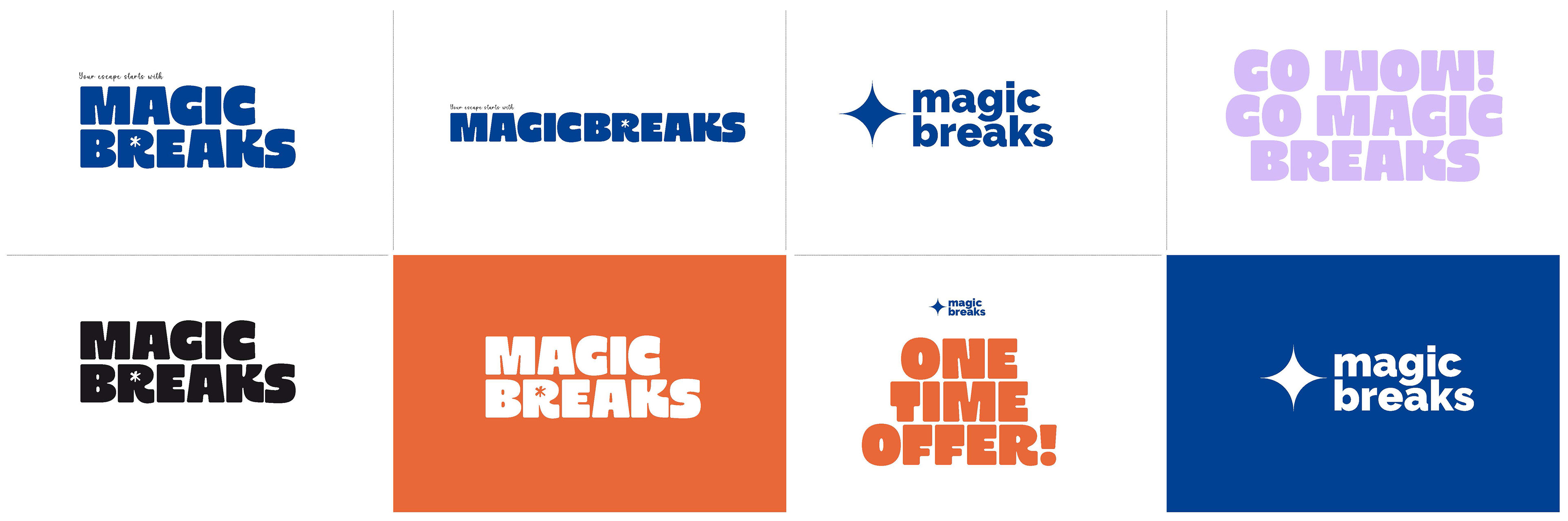

The final identity transformed the iconic star into a flexible brand mark that could work across different formats and campaign applications. A bold, contemporary typographic system supported this shift, giving the brand a stronger, more distinctive presence while maintaining a sense of fun, energy, and adventure.